

Content provided by The Perth Mint
Written by Jordan Eliseo, Senior Investment Manager, The Perth Mint
The sharp correction in global equity markets since late February is encouraging SMSF trustees to revisit the asset allocation in their portfolios, with safe haven assets like government bonds and gold outperforming risk assets over this time period.
One ratio that might be of interest to Australian investors looking to protect and build wealth in the current environment is the S&P 500 to Gold ratio. This ratio measures how many troy ounces of gold you could purchase with one “share” of the S&P 500. For example, if gold was trading at USD 1,000 per troy ounce, and the S&P 500 price index was at 1,000 points, then the ratio would be 1.
The reason this ratio is popular and worth monitoring is because it can easily gauge the ‘mood’ of the investment community. A low ratio indicates investors are feeling pessimistic about the outlook for the economy and financial markets, whilst a high ratio suggests investors are optimistic. Many believe a low ratio indicates that gold is expensive relative to equities, whilst a high ratio indicates that equities are expensive relative to gold.
The chart below plots the movements in the S&P 500 to Gold ratio from the beginning of the 1970s through to the end of last month, with the ratio sitting at 1.86 at the end of February 2020.

The chart highlights that there have been four distinct multi-year trends in the S&P 500 to Gold ratio over the last fifty years.
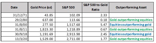
- A decline in the ratio throughout the 1970s, as stagflation saw equity markets disappoint and gold prices soar. The ratio fell from over 2.25 to below 0.2 between 1971 and February 1980.
- An increase in the ratio throughout the 1980s and 1990s, as equities embarked on one of their greatest ever bull-market runs and gold prices languished in a two-decade bear market. As the chart highlights, the ratio peaked at almost 5.5 in August of 2000.
- A decrease in the ratio from August 2000 through to August 2011, driven by a multi-year bull market in gold which saw the price rise from below USD 300 to above USD 1,800 an ounce. Equities were battered by the NASDAQ crash, the September 11, 2001 terrorist attacks and the Global Financial Crisis, which contributed to the ratio dropping from 5.47 to just 0.67 during this period.
- An increase in the ratio from 0.67 in late 2011 to 2.45 by September 2018. This was driven by a rally in the S&P 500 where it rose from 1,219 to 2,913 points and gold prices (in US dollars) fell by 35% over this time period.
The table below plots the price of gold, the price level of the S&P 500, and the S&P 500 to Gold ratio at each of the inflection points mentioned above. It also details the reading as at the end of Friday 13 March 2020, when data for this article was collated.
The ratio has begun to turn down again
The table above highlights the fact that the S&P 500 to Gold ratio has begun to move lower over the past 18 months, falling from 2.45 at the end of September 18 to 1.77 on Friday March 13, 2020.
This demonstrates the fact that gold has outperformed the S&P 500 recently, with the USD price of gold up by 28.31%, whilst the S&P 500 has declined by 6.97% over this time period.
This is important as a declining ratio will likely encourage further investment into gold going forward, particularly when the fall in the ratio is being driven by heightened volatility in equity markets.
In periods where gold and equities rise together (like they did for most of 2019), there is minimal to no opportunity cost if a portfolio manager or personal investor doesn’t own gold, as their stock portfolio is growing.
Gold going up alongside the equity market is a curiosity to many investors. Gold going up whilst equities are tanking and fear abounds is an entirely different phenomenon. One that typically leads to an increase in all types of investors wanting to own the precious metal.
What happens next?
From 1971 through to the end of February 2020, the S&P 500 to Gold ratio has averaged 1.54, roughly 13% below the 13 March 2020 reading of 1.77. By this metric, gold is somewhat cheap relative to equities, though nowhere near as cheap as it was on a relative basis back in August 2000, when the ratio was above 5. Gold is also not as expensive as it was on a relative basis in February 1980, when the ratio bottomed out at 0.18.
Whilst no one can state definitively which way this ratio will move going forward, there is a good chance it will continue to decline, with gold continuing its recent outperformance relative to equity markets.
Even if the impact of Coronavirus is less severe than currently anticipated it remains a fact by many metrics, including price to sales and cyclically adjusted price earnings ratios, that equity markets even after their recent correction are still expensive by historical standards.
To that end, whilst the recent pain we have seen in equity markets has been swift, it has not yet been brutal, at least not relative to prior periods where equities were trading at such lofty multiples, with historical drawdowns of over 50% not uncommon.
The policy response that we have seen from central banks since late February, coupled with already low to negative real interest rates and government bond yields, will of course provide some support for equity markets going forward, but history would suggest it will also benefit gold. Indeed research from The Perth Mint looking at investment returns from 1971 to 2019 found that gold delivered average annual increases of just over 20% in years where real interest rates were 2% or less, like they are today.
Given all of these factors, the strategic case for including gold in an investment portfolio today remains compelling.
Content provided by:

Disclaimer: Past performance does not guarantee future results. The information in this article and the links provided are for general information only and should not be taken as constituting professional advice from The Perth Mint. The Perth Mint is not a financial adviser. You should consider seeking independent financial advice to check how the information in this article relates to your unique circumstances. All data, including prices, quotes, valuations and statistics included have been obtained from sources The Perth Mint deems to be reliable, but we do not guarantee their accuracy or completeness. The Perth Mint is not liable for any loss caused, whether due to negligence or otherwise, arising from the use of, or reliance on, the information provided directly or indirectly, by use of this article.